Skip to content

Aurethic

  1. Home
  2. Projects
  3. Frilotec

Client project · Website in review

A website that shows
the craft.

A new website for Frilotec, an air-conditioning, ventilation and industrial refrigeration company in Pamplona: structure, art direction, web design, user experience and mobile, built in WordPress and Elementor.

Client

Frilotec Climatización S.L.

Sector

HVAC and refrigeration · Navarre

Areas

Structure · Art direction · Web design · UX · Mobile · Technical SEO

Status

In review with the client · October 2026

The service behind the project

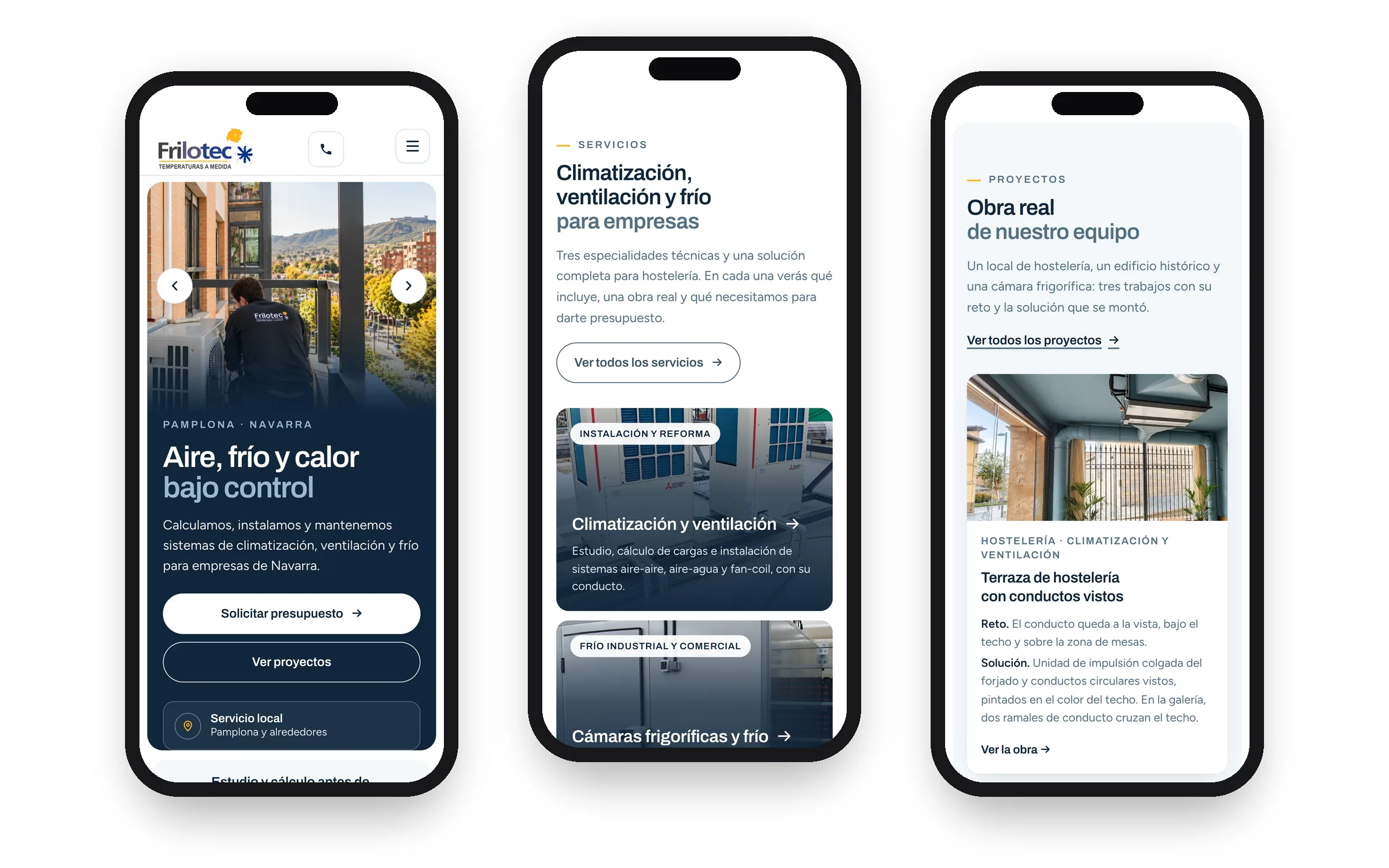
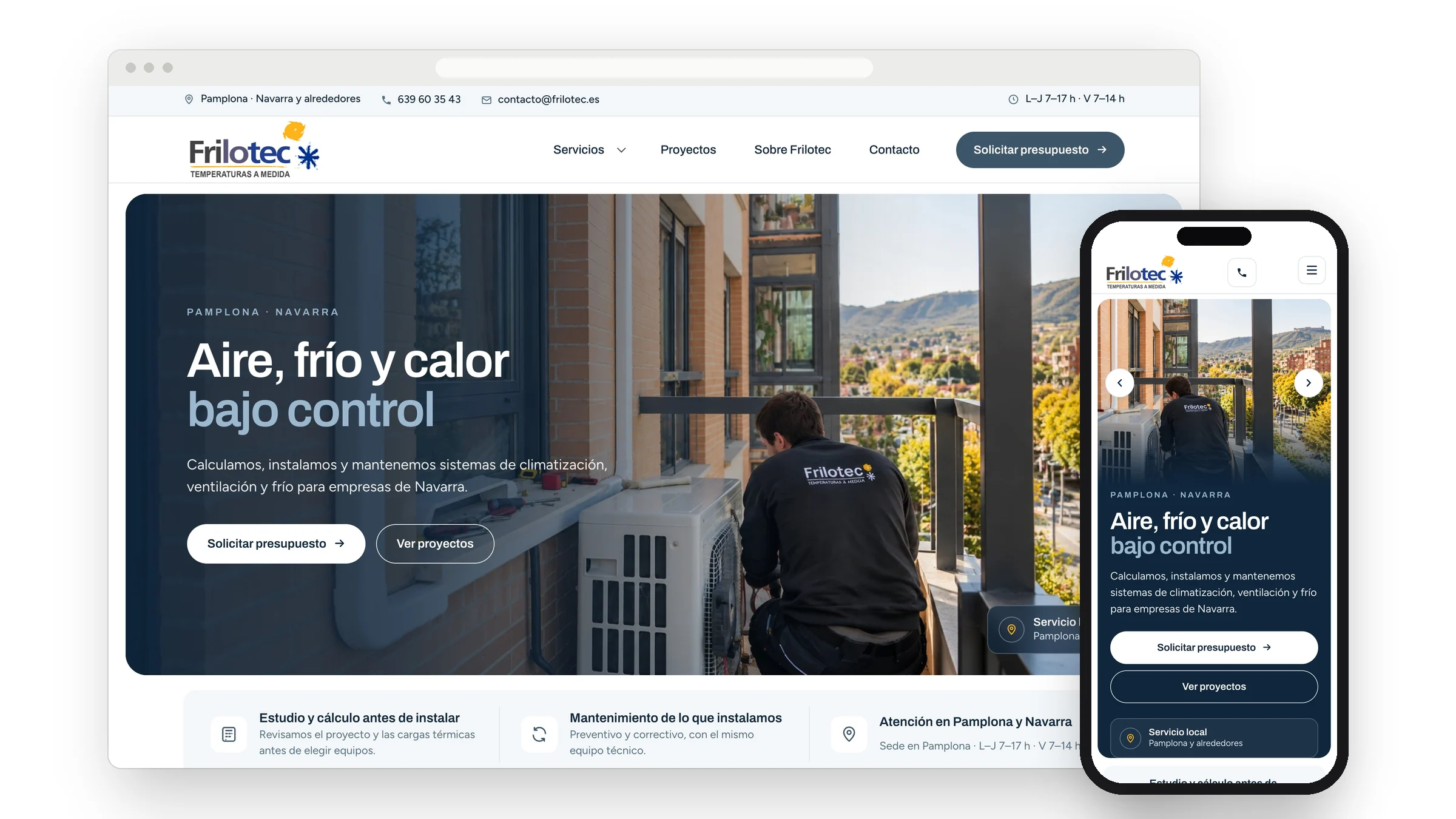
Frilotec’s new home page on desktop and mobile: the headline “Aire, frío y calor bajo control” over a real job photo
Project status. The website is finished in a review environment, not indexed, while Frilotec checks some technical copy and decides when to launch it on its domain. There is no traffic or enquiry data yet: it will be measured after launch. The images are real screenshots of that version.

Act 01

The business and the goal

Who Frilotec is

From Pamplona, Frilotec designs, installs and maintains air-conditioning, ventilation, cold rooms and commercial refrigeration for businesses, hospitality venues and buildings across Navarre.

Its previous website ran on a template platform and did not tell that technical story: it spoke in general terms and showed almost no real work.

The goal

A business or a venue should understand in seconds what Frilotec does and for whom, see real jobs with their context, and request a quote, call or message on WhatsApp without searching.

Act 02

What we found

Needs we identified

We reviewed the 39 URLs of the previous website in September 2026. These weighed most:

  • A message without focus. The home page headline was «Climatización Navarra» and the browser tab read «Inicio: Frilotec».
  • Obstacles to contact. The phone number sat behind a «Ver teléfono» button and the directions link pointed to an address in Madrid.
  • Template leftovers. Buttons that went nowhere, English labels such as «Request a quote» or «Find Us» on a Spanish site, and a chat assistant that greeted visitors in English.
  • Empty pages (shop, virtual tour, news, blog) and not a single job explained with its problem and its solution.

What that meant

Frilotec has craft and real work, but the website did not prove it. The job was not decoration: it was organising the information so that trust is earned with evidence.

Act 03

What we did

Structure

A home page in blocks that answer what visitors ask: what do you do, where have you done it, who does it and how do I reach you. Five service pages, job sheets with the challenge and the solution, and technical guides for common questions.

Art direction

A sober, technical system: night blue and graphite for the engineering side, with the amber of the logo as the accent. Headlines in Archivo, body text in Figtree and real job photography instead of stock images.

Web design and user experience

Service area, phone, email and opening hours visible from the header; «Request a quote» as the main action and WhatsApp as the alternative; service cards with what each one includes, and a form with clear error messages.

Mobile

Designed for mobile, not just shrunk: its own crop of the main photo, a call button in the header and full-width buttons.

Technical SEO and accessibility

Titles and descriptions per page, structured data for the business and each service, redirects from the old URLs ready for launch day, checked contrast and a visible focus state for keyboard users.

From design to decision

Every block
has a reason.

Real screenshots of the review version. Next to each one: what was decided and what it is for.

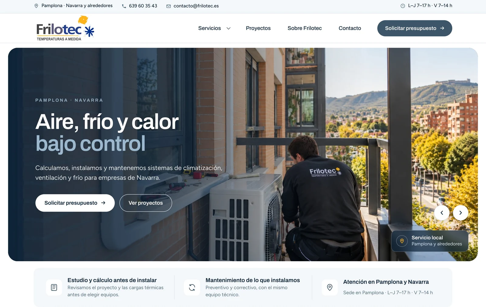
First screen of the Frilotec website: bar with service area, phone and opening hours, headline, two buttons and a strip of assurances

01

What, where and for whom on the first screen

The decision

A short headline with the benefit, «Aire, frío y calor bajo control» (air, cold and heat under control), plus the area and the audience, over a real photo of a Frilotec technician at work.

Why it helps

Visitors know within seconds whether they are in the right place, and have two clear ways forward: request a quote or see the work.
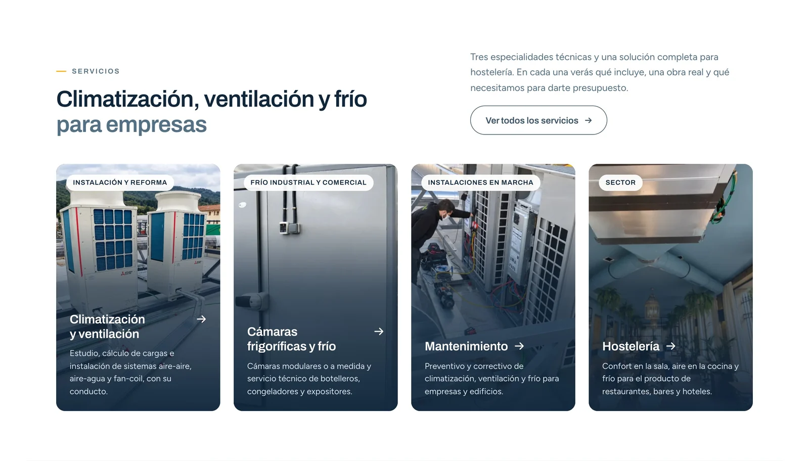
Frilotec services block: four cards with real photos, a job-type label and a one-line scope

02

Services you can tell apart at a glance

The decision

Four cards with real photos, a job-type label (installation, industrial and commercial refrigeration, maintenance, hospitality) and one line on what each includes.

Why it helps

Businesses choose by need rather than by technical service name, and land on a page that explains it.

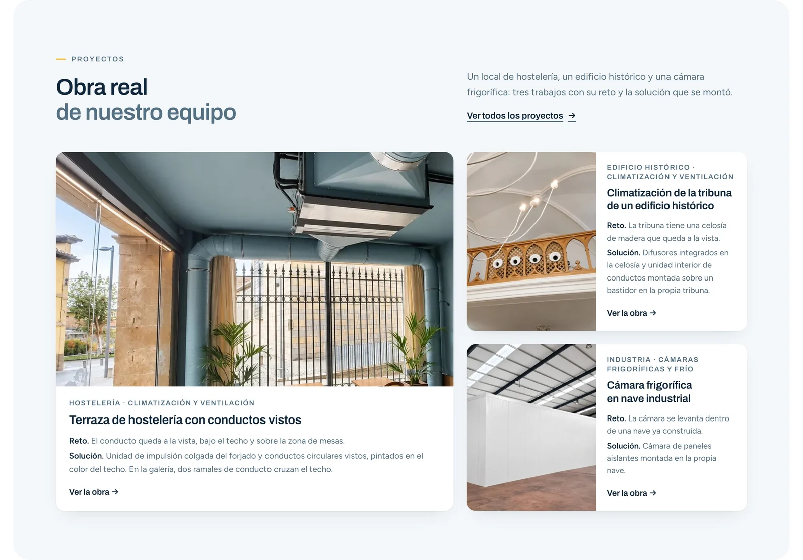
“Obra real de nuestro equipo” block: three jobs, each with its challenge and the solution installed

03

Real work, with challenge and solution

The decision

Every job is told the same way: project type, the specific challenge and the solution installed, with photos from the job itself.

Why it helps

This is the evidence the old website lacked: it shows technical judgement without inventing figures or clients.

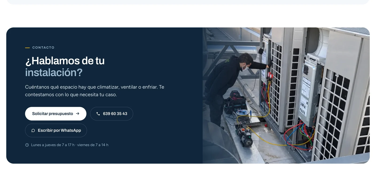
Closing band of the Frilotec home page with “Solicitar presupuesto”, phone, WhatsApp and opening hours

04

Contact without searching

The decision

A closing band with a direct question, «Request a quote», phone and WhatsApp side by side, and the opening hours in view.

Why it helps

Each visitor picks their channel. People who prefer to call do not have to fill in a form.

Does your website not show
what you can do either?

Tell us what you have now and what you need. We will look at it in a free 30-minute meeting and tell you where we would start.

The service behind the project

Web design

Websites that explain your value and make the next step easy.

Next project

FIR Advocats

Client project

Scroll al inicio